

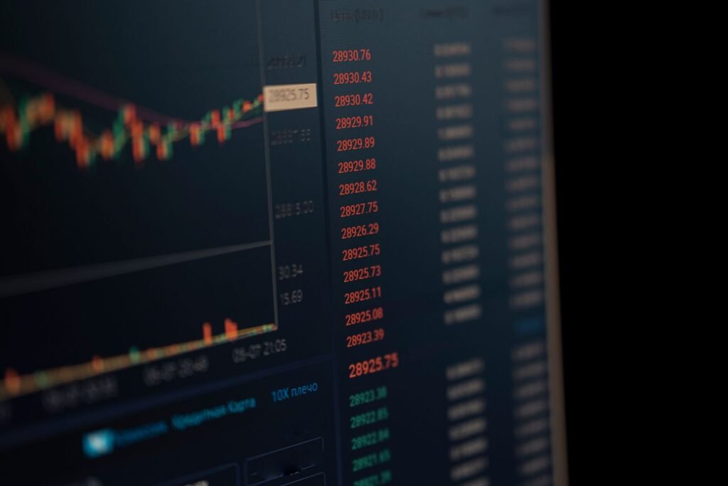
To interpret candlestick patterns you have to look at everything except the pattern first: where it formed, what the trend was doing, whether the next candle confirmed it, and what volume said. The shape is the last and least informative input. A hammer at a tested support level after six down days is a reading; the identical hammer in the middle of a range is a coincidence.
This assumes you already know the vocabulary. If “gravestone doji” and “bullish harami” are not yet familiar shapes, start with the basics of candlestick patterns and come back. What follows is the part almost nobody teaches: the process of turning a shape into a judgment, and the judgment into something you can measure.
The six-question framework
1. Location beats shape
This is the whole game. Ask where the candle formed before you ask what it is called.
A long lower wick that touches a level price has bounced off three times in the past four months is telling you something specific: buyers are defending a price they have defended before. The same wick 3% into the middle of a directionless range tells you that price wandered down and wandered back, which happens constantly and means nothing. Locations that give a pattern context include prior swing highs and lows, round numbers, the edges of an established range, a rising or falling moving average that price keeps respecting, and gaps left unfilled.
If you cannot name the level the pattern formed at, you do not have a location, and you should stop there.
2. What came before it
Every reversal pattern is defined relative to a prior move. A hammer is a hammer because a decline preceded it. That preceding move needs to be real: several consecutive lower closes, or a visible drop in percentage terms, not two flat days. Continuation patterns need the mirror image, an established trend that the pattern sits inside.
Also ask how the move got there. A slow, orderly six-week drift down is a different setup from a single 9% gap down on an earnings miss, even if today’s candle looks identical in both cases.
3. Confirmation on the next candle
Acting on an unconfirmed pattern is the classic beginner error, and it is worth being precise about why. A pattern is a hypothesis: “the balance of pressure has shifted.” The cheapest test of that hypothesis is the next candle. If a hammer forms and the following session opens higher and closes above the hammer’s high, the hypothesis survived one round of evidence. If the following session closes below the hammer’s low, it did not, and you never took the trade.
The cost of waiting is a worse entry price. The benefit is that you skip a large share of the patterns that fail immediately. That trade-off is usually worth taking, and it is easy to measure for yourself.
4. Volume as corroboration
Volume tells you how many participants were involved in producing the shape. A bullish engulfing candle on twice the twenty-day average volume represents real repositioning. The same shape on a third of average volume is a handful of trades in a quiet session.
The useful comparison is always relative: today’s volume against a recent average for that same instrument, not against some absolute number. Volume also matters in the other direction. A long wick on heavy volume means price was pushed there and rejected by a lot of participants. A long wick on almost no volume often just means the order book was empty for a minute.
5. Timeframe alignment
The same price history produces different patterns at different resolutions, so ask whether the timeframe above yours agrees. If you found a bullish reversal on the daily chart, look at the weekly. Is the weekly candle still making lower lows inside a downtrend? Then your daily reversal is, at best, a counter-trend bounce inside a larger move down, and it should be treated with correspondingly less confidence.
A workable habit: use one timeframe up for direction, your own timeframe for the setup, and one timeframe down only for timing an entry. Three is plenty. More than that and you will always find one that agrees with what you already wanted to do.
6. Confluence with other tools
Confluence means several independent things pointing the same way. Common combinations that are genuinely independent of the candle shape:
- Moving averages: is the pattern forming at a moving average that price has repeatedly turned at, or is it forming in open space?
- Horizontal support and resistance: the most useful single overlay, because it is drawn from actual prior transactions.
- RSI or another oscillator: useful mainly for divergence. A new price low that does not produce a new oscillator low is a different situation from one that does.
- Volatility measures: a reversal candle whose range is three times normal means something different from one with an average range. Average True Range puts a number on that.
- Buying and selling pressure: tools such as the Elder Ray Index separate bull and bear power, which can corroborate or contradict what a wick appears to say.
Two caveats. Stacking five indicators that all derive from closing price is not confluence, it is the same information counted five times. And more filters means fewer setups, which is usually good but means it takes longer to gather enough observations to know whether your process works.
A worked walkthrough, in words
Here is the process running end to end on a hypothetical daily chart. The numbers are illustrative, not a real security.
- Zoom out first. Six months of daily candles. Price ran from $38 to $56 over four months, then rolled over. The last three weeks are lower highs and lower lows. So: uptrend, now correcting.
- Mark the levels before looking for patterns. There is a shelf around $47 where price consolidated for two weeks on the way up. The 50-day moving average is at $47.60 and rising slowly. Two levels within 60 cents of each other.
- Now look at the recent candles. Six of the last eight sessions closed lower. Yesterday’s candle opened at $47.90, traded down to $46.40, and closed at $47.20. Small body near the top, long lower wick roughly twice the body. That is a hammer, and it formed inside the $47 shelf.
- Check volume. Yesterday traded about 70% above its twenty-day average. Participation was real, and the low was rejected by a crowd rather than by silence.
- Check the weekly. The weekly chart still shows an uptrend with higher lows. The correction has not broken the larger structure. The daily pattern and the weekly trend agree.
- Wait for the next candle. Today opens at $47.40 and closes at $48.10, above yesterday’s high of $47.90. The hypothesis survived. Had today closed at $46.20, below the hammer’s low, it would have failed and there would be nothing to do.
- Write the reading in one sentence. “Pullback into a prior consolidation shelf and a rising 50-day average, rejected on above-average volume, confirmed by the following close.” That sentence, not the word “hammer,” is the analysis.
Notice how much of that had nothing to do with candlesticks. That ratio is roughly correct.
Turning a reading into a defined trade
A pattern without a predefined invalidation point is not a plan. It is a feeling with a Japanese name attached. Three numbers turn it into something you can execute and later evaluate.
Where invalidation sits
The invalidation level is the price at which your reading was simply wrong, not the price at which you would prefer to stop losing money. For the hammer above, the entire premise was that $46.40 was rejected. If price trades back below $46.40 and closes there, the premise is void. So the invalidation level sits just below that low, at say $46.30.
Place it where the idea dies, then size the position to make that distance affordable. Doing it in the other order, choosing a dollar loss you are comfortable with and then putting the stop there, is how people end up stopped out by normal noise on a thesis that was actually fine.
Position sizing from the stop distance
Once you know entry and invalidation, the risk per share is fixed, and position size follows from how much of the account you are willing to risk on one idea.
Account equity          $30,000
Risk per trade (1%)     $300
Entry                   $48.15
Invalidation            $46.30
Risk per share          $48.15 - $46.30 = $1.85

Shares = $300 / $1.85 = 162.2  ->  162 shares
Position value = 162 x $48.15  =  $7,800.30
Actual risk    = 162 x $1.85   =  $299.70
The position happens to be about 26% of the account, which surprises people. That is the point: the size is an output of the stop distance, not a decision you make separately. A wider invalidation on the same 1% risk would produce a much smaller position.
Risk-reward, and what win rate it implies
Now ask what the trade is reaching for. If the prior swing high at $53.00 is the logical objective, reward per share is $4.85 against $1.85 of risk, roughly 2.6 to 1. At that ratio you break even at a win rate of about 28%. If your honest estimate of the setup’s hit rate is below that, the trade is not worth taking regardless of how textbook the candle looked.
That calculation is the most useful thing on this page, because it converts “does this pattern work?” into “does this pattern work well enough given this specific stop and target?” Those are different questions and only the second one is answerable.
From pattern to questions: a working checklist
| Pattern observed | Questions to ask before acting | What would invalidate the reading |
|---|---|---|
| Hammer after a multi-week decline | Is it at a level price has defended before? Was volume above average? Did the next candle close above the hammer’s high? | A close below the hammer’s low |
| Bearish engulfing at a prior high | Is that high a real resistance level or an arbitrary point? Did the engulfing body cover the whole prior body, or just most of it? | A close above the engulfing candle’s high |
| Doji in the middle of a range | Is there any level here at all? How many dojis has this instrument printed in the last month? | Nothing, because there was no reading to invalidate |
| Morning star at a rising moving average | Has price turned at this average before, or is this the first touch? Does the weekly trend still point up? | A close below the middle candle’s low, or a decisive break of the average |
| Shooting star on below-average volume | Was the upper wick made in normal trading or in a thin session? Is the instrument liquid enough for wicks to mean anything? | Treat it as unconfirmed until a normal-volume session agrees |
| Bullish engulfing right after a gap down | What caused the gap? Is the “engulfing” only engulfing because the open was artificially low? | A close back inside the gap, or any close below the pattern low |
| Three consecutive strong candles (soldiers or crows) | Is this the start of a move or the exhaustion of one? How far is price from its recent average? | A close back inside the first candle of the three |
Failure modes worth knowing in advance
The choppy range
Sideways markets manufacture reversal patterns endlessly, because price is by definition turning around repeatedly. Every hammer at the bottom of a two-dollar range is followed by a shooting star at the top of it, and both “work” for about a day and a half. The tell is that your invalidation and your target are both inside the same range, which means the reward is bounded by noise. When you cannot identify a trend to reverse, most reversal readings are meaningless.
Gaps
Gaps break candlestick logic in a specific way: several patterns are defined by the relationship between one candle’s open and the previous candle’s body, and an overnight gap sets the open by news rather than by trading. A bullish engulfing produced by a gap-down open followed by a normal session is arithmetically the same shape as one produced by continuous trading, but the mechanism is entirely different. Assets that trade nearly continuously gap less, which is one reason patterns look different in futures and crypto than in single stocks.
Low liquidity
On a thinly traded small cap, a wide spread alone can print a wick. Patterns require enough transactions to represent a genuine balance of pressure. If the instrument trades a few thousand shares a day, the candles are describing the behavior of a handful of orders.
Chance
The most underrated failure mode. Candlestick definitions are loose, so the shapes appear constantly. A screener looking for hammers across a few thousand US stocks will return dozens every single day, in every market condition. That base rate is why a chart showing five successful hammers proves nothing: it was selected from an enormous pool of candidates after the fact.
Backtest your own reading rather than trusting published win rates
Published pattern statistics are close to useless for you, for reasons worth spelling out. The definitions differ between sources: how small does a body have to be to count as a doji, how long does a wick have to be for a hammer, does an engulfing candle need to swallow the wicks or just the body? Change the threshold and the population of matching candles changes, and so does the result. The exit rule matters just as much as the entry, and most published figures do not state one. And the chart examples in pattern guides are chosen because they worked.
The peer-reviewed work is more careful and correspondingly less flattering. Marshall, Young and Rose found that candlestick strategies did not create value on Dow component stocks from 1992 to 2002 over ten-day holds. Duvinage, Mazza and Petitjean tested 83 candlestick rules on five-minute Dow data and found some predictive ability but no rule that beat buy-and-hold after trading costs. Other studies find modest effects in other markets. The reasonable conclusion is not “candles are worthless” but “any edge is small enough that your own execution, costs and discipline will dominate it.”
So test your own version. A workable minimum:
- Write your rules down before you look at any data, including the exact pattern definition, the location requirement, the confirmation requirement, the entry, the invalidation and the exit.
- Fix the instrument list and the date range in advance so you cannot quietly drop the periods that went badly.
- Record every occurrence, including the ones you would not have taken. The skipped trades are how you find out whether your filters help.
- Subtract realistic costs: commissions, spread and slippage on both sides.
- Keep a portion of the history untouched and only test on it once, at the end.
Two biases will try to flatter your results. Survivorship bias comes from testing only instruments that exist today, which quietly excludes everything that was delisted. Selection bias comes from adjusting a rule after seeing how it performed, then reporting the adjusted version as if you had chosen it in advance. Both make a mediocre process look excellent. If the honest answer turns out to be that your reading has no edge, that is a genuinely useful result, and it is the same reason a lot of people keep most of their money in things that do not require a chart at all, from index funds to property in different state markets.
Common mistakes when interpreting patterns
- Finding the pattern first. If you scan for shapes and then look for a level to justify them, you will always find one. Mark levels first, then look at candles.
- Entering before the close. Half the patterns you act on intraday will not exist at the end of the session.
- Letting the target set the stop. The invalidation level is determined by the chart, not by the profit you want.
- Counting correlated indicators as confluence. Three moving averages agreeing is one piece of evidence, not three.
- Changing timeframes after entry. Dropping to a lower timeframe to justify holding a losing position is the most reliable way to turn a small loss into a large one.
- Keeping no record. Without a log of what you read, what you did and what happened, you cannot improve. You can only remember selectively.
Frequently asked questions
How do I know if a candlestick pattern is confirmed?
Define confirmation before you need it. The common standard is that the next candle closes beyond the pattern’s extreme in the expected direction: above the high for a bullish reading, below the low for a bearish one. Some traders also require above-average volume on the confirming candle. Whichever you pick, keep it constant so results are comparable.
What is the most important factor when interpreting candlestick patterns?
Location. The same shape means different things at a tested support level, in the middle of a range, and inside a strong trend. Every study and every experienced trader converges on this: context determines whether a pattern carries information, and shape alone almost never does.
Should I use candlestick patterns with indicators?
Usually yes, but only with tools that add independent information. Horizontal support and resistance, volume and a volatility measure such as ATR each tell you something the candle body does not. Piling on several oscillators that all derive from closing price adds confidence without adding evidence.
Why do candlestick patterns fail so often?
Because the definitions are loose enough that the shapes occur constantly by chance, and because a pattern describes one period of trading rather than a cause. Ranges, gaps, thin liquidity and news all produce textbook shapes with no follow-through. Costs then remove much of whatever small edge remains.
How many trades do I need before I trust my results?
More than feels reasonable. With outcomes this noisy, a few dozen trades cannot separate skill from luck, and a run of eight winners proves nothing. Treat any sample under about a hundred occurrences as a rough indication, and keep testing on data you have not looked at yet.
Do candlestick patterns work better on some timeframes?
Daily and weekly candles tend to carry more information per candle, because each one summarizes a full session with a meaningful open and close. Intraday patterns are more numerous and noisier, and the trading costs of acting on them are proportionally much larger relative to the moves involved.
The bottom line
Interpreting candlestick patterns well is mostly a matter of putting the pattern last. Mark your levels, establish the trend, wait for the close, check volume, look one timeframe up, and only then let the shape tip a decision you were already close to making. Then write down the price that proves you wrong and size the position from that number.
Do that consistently and you will find that most patterns you see get discarded, which is the correct outcome. The honest position, given the published evidence, is that named patterns provide a small and unreliable edge at best. What does reliably matter is where you enter, where you get out, how much you risk, and whether you keep records good enough to tell the difference between a process that works and a streak that flattered you.
About this article: GeekBlog covers U.S. technology news, AI, phones, smartwatches and gaming. Every story is written and checked under our Editorial Policy. Spotted a mistake or have a story tip? Contact our editors.
