

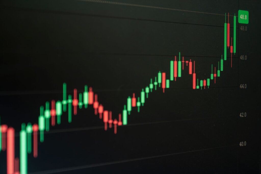
A candlestick chart plots four prices for every time period: the open, the high, the low, and the close. Candlestick patterns are the shapes those four numbers make, and each shape describes how the fight between buyers and sellers played out during that session. Learning them properly starts with reading one candle, not memorizing a glossary of names.
This guide is the foundation layer. It covers what a candle physically is, what the parts mean, how the meaning changes with the timeframe, and the shapes worth recognizing on sight. It does not try to sell you a system. If you want the method side, how to judge whether a pattern actually matters in a given spot, that belongs in a separate piece on how to interpret candlestick patterns rather than just name them.
The anatomy of a single candlestick
One candle summarizes one time period. If you are looking at a daily chart, each candle is one trading day. Four numbers build it, and every visual feature comes from those four.
   BULLISH CANDLE                BEARISH CANDLE
   (close above open)            (close below open)

        high                          high
         |                             |
         |   upper wick                |   upper wick
      +-----+  close               +-----+  open
      |     |                      |#####|
      |     |  real body           |#####|  real body
      |     |                      |#####|
      +-----+  open                +-----+  close
         |                             |
         |   lower wick                |   lower wick
        low                           low
The real body
The body runs from the open to the close. Its height is the net result of the session: how far price actually travelled from start to finish. A tall body means the period ended a long way from where it began. A short body means price finished roughly where it opened, whatever happened in between.
The wicks
The thin lines above and below the body are wicks, also called shadows or tails. The upper wick reaches to the session high, the lower wick to the session low. Wicks are rejection: price got there and did not stay. A long upper wick on a daily candle means buyers pushed the price up during the day and sellers pushed it all the way back down before the close. That is genuinely useful information, and it is the single biggest thing a candle tells you that a closing price alone cannot.
Color conventions
In the original Japanese convention candles were hollow (white) when the close was above the open and filled (black) when the close was below it. Modern platforms almost always default to green for up and red for down, and nearly all of them let you change it. Color encodes exactly one thing: whether the close was above or below the open. It says nothing about whether the period was up or down compared with the previous close, which is why a candle can be green on a day the asset finished lower than yesterday.
Why candles beat a line chart
A line chart connects closing prices. It is clean, and it is fine for looking at a decade of returns. But it deletes the conflict inside each period, and the conflict is often the story.
Take two days that both close at $50.00. On the first, the asset opened at $49.90, drifted, and closed at $50.00. On the second, it opened at $49.90, spiked to $54.00, collapsed to $48.00, and clawed back to $50.00. The line chart draws the same dot. The candle chart draws a small body on day one and a huge two-sided range on day two. Anyone sizing a position or placing a stop cares enormously about that difference, which is also the intuition behind volatility measures like the Average True Range indicator.
OHLC bar charts carry exactly the same four numbers. The only real advantage of candles is that the filled body makes direction and range readable at a glance across hundreds of periods. That is a legibility win, not an information win.
What a “candle” means on a 5-minute, daily, or weekly chart
A candlestick pattern has no fixed duration. The shape depends entirely on the timeframe you selected, and the same price history produces different patterns at different resolutions.
- 5-minute chart: each candle is 300 seconds of order flow. A “hammer” here may be one large order and a couple of algorithms reacting to it. Noise dominates.
- Daily chart: each candle is a full session, with a real open (which absorbs overnight news) and a real close (which absorbs end-of-day positioning). Daily candles carry the most meaning per candle for most people.
- Weekly chart: the open is Monday’s open, the close is Friday’s close, and the wicks span the week’s extremes. A weekly doji represents five days of genuine stalemate, which is harder to produce by chance than a five-minute one.
Two practical consequences. First, patterns on very short timeframes appear constantly, so their individual significance is low. Second, the “session” concept gets fuzzy for assets that trade around the clock. A daily candle in crypto or spot forex depends on which exchange or which UTC cutoff your platform uses, so the same day can produce a hammer on one feed and an ordinary candle on another.
The single-candle shapes worth knowing
Marubozu
A long body with little or no wick at either end. Literally “shaved head” or “shaved bottom.” A bullish marubozu opened at or near its low and closed at or near its high, meaning buyers controlled the entire period without a meaningful pullback. The bearish version is the mirror image. This is the most one-sided candle there is.
Spinning top
A small body with long wicks on both sides. Price ran a long way in both directions and finished near where it started. That is indecision, expressed precisely: plenty of activity, no resolution. Whether it matters depends on what came before it.
Doji and its variants
A doji is a candle whose open and close are effectively equal, so the body is a horizontal line. What distinguishes the variants is where that line sits within the range:
- Standard doji: small wicks either side. A quiet, unresolved period.
- Long-legged doji: long wicks both ways. Violent two-sided action that settled nowhere.
- Dragonfly doji: open, high and close together at the top, one long lower wick. Price was sold hard and recovered all of it.
- Gravestone doji: open, low and close together at the bottom, one long upper wick. Price was bought hard and gave all of it back.
On thinly traded instruments a doji is often just an absence of trades rather than a standoff. Check volume before reading anything into it.
Hammer and hanging man
These two are the same shape: a small body near the top of the range with a long lower wick, typically at least twice the body height. The name changes with location. Call it a hammer when it appears after a decline, where the long lower wick says sellers pushed price down and were fully rebuffed. Call it a hanging man when the identical shape appears after an advance, where the same wick says selling pressure has arrived for the first time in a while.
That single fact, that the name depends on context rather than geometry, is the most important thing on this page. The shape is not the signal.
Inverted hammer and shooting star
Again one shape, two names. A small body near the bottom of the range with a long upper wick. After a decline it is an inverted hammer: buyers finally managed a serious push, even though they could not hold it. After an advance it is a shooting star: buyers pushed to a new high and were rejected all the way back down, which is the more widely watched of the two.
Two- and three-candle patterns, briefly
Multi-candle patterns are combinations, and the logic is compositional rather than new. Three families cover most of what you will see named:
- Engulfing: a second candle whose body completely covers the first candle’s body, in the opposite direction. Read it as one side taking back more than a full period of the other side’s work.
- Harami: the opposite arrangement. A small second body sits entirely inside the previous large body. Momentum contracted rather than reversed. “Harami” is the Japanese word for pregnant, which is a reasonable mnemonic for the shape.
- Morning and evening star: three candles. A strong candle in the prevailing direction, then a small indecisive candle (often a doji) that gaps away from it, then a strong candle in the opposite direction. Morning star at a low, evening star at a high.
Reference table: the best-known candlestick patterns
“Bias” below is the conventional textbook reading, not a probability. Every entry assumes the pattern appears in a relevant location, which is a much bigger condition than it looks.
| Pattern | Candles | Conventional bias | What the shape says about the session |
|---|---|---|---|
| Bullish marubozu | 1 | Bullish | Opened at the low, closed at the high, no pullback worth showing |
| Bearish marubozu | 1 | Bearish | Opened at the high, closed at the low, sellers unopposed |
| Spinning top | 1 | Neutral | Wide two-way range, finished near the open |
| Doji | 1 | Neutral | Open and close effectively identical: no net progress |
| Long-legged doji | 1 | Neutral | Large excursions both directions, all of it reversed |
| Dragonfly doji | 1 | Bullish lean | Sold off hard, recovered the entire move by the close |
| Gravestone doji | 1 | Bearish lean | Rallied hard, gave the entire move back by the close |
| Hammer | 1 | Bullish lean (after a decline) | Long lower wick: a push down that was fully rejected |
| Hanging man | 1 | Bearish lean (after an advance) | Same shape as a hammer, but selling pressure appearing at a high |
| Inverted hammer | 1 | Bullish lean (after a decline) | Long upper wick: buyers finally mounted a real attempt |
| Shooting star | 1 | Bearish lean (after an advance) | New high made and rejected all the way back |
| Bullish engulfing | 2 | Bullish | An up body swallows the previous down body whole |
| Bearish engulfing | 2 | Bearish | A down body swallows the previous up body whole |
| Piercing line | 2 | Bullish | Opens below the prior low-ish and closes past the prior midpoint |
| Dark cloud cover | 2 | Bearish | Opens above the prior high-ish and closes back below the midpoint |
| Bullish harami | 2 | Bullish lean | Range contracted inside a large down candle: selling stalled |
| Bearish harami | 2 | Bearish lean | Range contracted inside a large up candle: buying stalled |
| Tweezer top / bottom | 2 | Contextual | Two consecutive candles share almost the same high or low |
| Morning star | 3 | Bullish | Down candle, then indecision, then a strong up candle |
| Evening star | 3 | Bearish | Up candle, then indecision, then a strong down candle |
| Three white soldiers | 3 | Bullish | Three solid up bodies, each closing higher than the last |
| Three black crows | 3 | Bearish | Three solid down bodies, each closing lower than the last |
The honest limits of candlestick patterns
Three things are worth saying plainly, because most beginner material skips all three.
Patterns are descriptive, not predictive. A hammer is a factual summary of a session that has already closed. Calling it a “reversal pattern” is a hypothesis about what happens next, and that is a much stronger claim than the shape supports on its own.
The academic evidence is mixed and mostly unflattering. Marshall, Young and Rose tested 28 candlestick patterns on Dow Jones Industrial Average component stocks from 1992 to 2002 and concluded that candlestick trading strategies did not create value over ten-day holding periods. The same lead author later found no evidence of value in Japanese equities over 1975 to 2004, across three sub-periods and in both bull and bear markets. Duvinage, Mazza and Petitjean tested 83 candlestick rules on five-minute Dow data and found some measurable predictive ability, but concluded that no single rule beat buy-and-hold once trading costs were included. Other work is friendlier: Lu, Shiu and Liu reported three profitable bullish reversal patterns in the Taiwan market from 2002 to 2008. The fair summary is that any edge is small, market-specific, period-specific, and easily eaten by costs.
Reliability percentages you read online are usually unsourced. If a page tells you a morning star “works 78% of the time,” ask which market, which years, which definition of the pattern, which holding period, and which exit rule. Change any of those and the number changes. Numbers presented without those five things are decoration.
None of this makes candles useless. They are an efficient way to see volatility, rejection and momentum, which is why volatility tools such as the Chandelier Exit trailing stop and sentiment tools such as the Elder Ray Index are usually read on candle charts. It just means the chart is an instrument panel, not an oracle. And it is worth remembering that active chart reading is one of the more demanding ways to engage with markets; the SEC’s own investing basics material starts with goals, emergency savings and diversification, and those questions come before any pattern does. Diversification is also why a lot of people put money into things that never print a candle at all, such as property in different state markets.
Common beginner mistakes
- Reading a candle before it closes. An in-progress candle changes shape continuously. A perfect hammer at 2pm can be a bearish marubozu at the close.
- Ignoring where the pattern sits. A hammer in the middle of a sideways range is not a hammer in any useful sense. It is a small body with a wick.
- Hunting patterns on one-minute charts. The lower the timeframe, the more the shapes are produced by chance and market microstructure.
- Confusing color with performance. Green means close above open, nothing more.
- Treating a name as a decision. Naming a pattern tells you nothing about entry, exit, size or invalidation.
Frequently asked questions
What timeframe should a beginner use for candlestick patterns?
Daily candles. Each one represents a full session with a genuine open and close, so the shapes carry more information and appear less often. Intraday charts generate far more patterns, most of which are noise, and they force decisions faster than a beginner can evaluate them. Weekly candles are useful for seeing the wider trend.
Do candlestick patterns work in crypto?
The shapes appear, because any market with an open, high, low and close produces candles. But crypto trades continuously, so the “daily” boundary is an arbitrary UTC cutoff that differs between platforms, and the same day can look different on two feeds. Thin order books also make wicks easy to produce with small volume.
Who invented candlestick charts?
Nobody can document that precisely. Munehisa Homma (1724 to 1803), a rice merchant from Sakata who traded at the Dojima Rice Exchange, is traditionally credited, and his 1755 book on market psychology is real. Direct evidence that he drew candlestick charts is thin, and the modern form was popularized in the West by Steve Nison’s 1991 book.
What is the difference between a doji and a spinning top?
Only body size. A doji has open and close at essentially the same price, so the body is a line. A spinning top has a small but visible body. Both describe a session that ended near where it started, and in practice most platforms use a tolerance threshold to decide which label to display.
How many candlestick patterns do I actually need to know?
Far fewer than the catalogs suggest. Marubozu, doji, spinning top, hammer and shooting star cover single candles; engulfing, harami and the star patterns cover the rest of what gets discussed. Understanding why each shape looks the way it does matters much more than the count.
Are candlestick patterns reliable?
Not reliably, on the published evidence. Several peer-reviewed studies find little or no exploitable edge in large US and Japanese equities once transaction costs are included, while a few find modest effects in other markets and periods. Treat candles as a description of trading activity, not a forecast.
The bottom line
Candlestick patterns are a compact notation for four prices, and the notation is genuinely good: bodies show net movement, wicks show rejection, and both are readable across a whole screen of history in a second. That is worth learning, and it takes an afternoon rather than a course.
What is not worth doing is treating the pattern list as a set of trade triggers. The evidence that named patterns predict returns is weak and inconsistent, and the confident win rates circulating online almost never come with the market, period and exit rules that would let you check them. Learn the vocabulary here, then spend your time on the part that actually decides outcomes: context, confirmation and risk. That is the subject of the companion guide on interpreting patterns in context.
